A Balanced Image Is Not Always a Centered One
Visual balance in composition comes from scale, spacing, contrast, and direction—not centering alone. Learn to read how an image distributes attention.
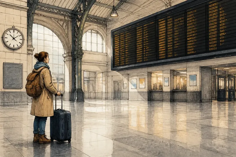
A small figure at the edge of a wide shot can balance a much larger shape across the frame. Visual balance in composition depends less on placing objects symmetrically than on how their scale, spacing, contrast, and direction distribute attention. The center is one useful anchor, not a rule that every image must obey.
To see how that works, imagine a hypothetical scene in a train station: a traveler waits beneath a broad departure board, with an open stretch of floor between them. The scene is being composed for a short film, and its creator wants the traveler to feel attentive rather than lost. The first arrangement centers the traveler. A second places the traveler off-center and lets the other elements answer that shift.
Centering gives the traveler immediate authority
In the first arrangement, the traveler stands near the middle of the frame. The departure board occupies the upper portion, and the station’s floor lines converge toward the figure. Because the person sits close to the visual center, the viewer has little work to do to locate the subject. The frame announces, plainly, “Look here.”
This is useful when a scene calls for directness. A centered face can make a statement feel deliberate; a centered object can seem ceremonial or fixed. Symmetry can also make a location feel orderly. In the station, the traveler appears held in place by the architecture, which may suit a moment of waiting.
But centering does not automatically produce balance. If a bright advertisement occupies one side, or a dark train doorway opens on the other, the image may still pull unevenly. The person’s position is only one part of the visual arrangement. A centered subject can share attention with an off-center patch of high contrast, sometimes more strongly than the filmmaker intends.
Off-center placement creates a relationship across empty space
For the second arrangement, imagine the traveler shifted toward the left third of the frame, facing across the open floor toward the departure board. The board remains high on the right. The empty space between them is not merely vacant: it gives the traveler’s gaze a destination and makes the board feel relevant to the person’s decision.
The composition now asks the viewer to connect two points. The traveler is the immediate human focus; the board provides a possible reason for the pause. The broad gap slows that connection. If the figure were pushed close to the edge, with little room in front of their face, the shot could feel cramped or as if the scene were pressing them out. Leaving space in the direction of the gaze keeps the frame open.
That space does not need to be filled with another object. Its shape matters. A clear corridor of floor can lead the eye toward the board, while a cluster of signs or passengers might interrupt the route. The composer’s task is not to make every area busy, but to decide whether the open area should read as waiting, distance, or an invitation to look elsewhere.
Scale, contrast, and direction can counterweight position
In the hypothetical station scene, the traveler is small compared with the departure board. That difference could make the board dominate, even though it contains no single face to hold attention. To prevent that, the filmmaker can give the traveler a distinct silhouette against a lighter patch of wall and keep the board’s lettering visually quiet. The larger object then supplies mass, while the figure’s contrast supplies a sharper point of attention.
These forces are not interchangeable, but they can work together:
- Scale: A broad object can carry visual weight through its area, while a small face may attract attention through detail.
- Spacing: Distance can separate elements or bind them into a relationship, depending on their alignment and the empty shapes around them.
- Contrast: A bright edge against a dark field, or a dark figure against a pale wall, can draw the eye without requiring central placement.
- Direction: A gaze, a line of architecture, or a body turned toward open space can guide attention across the frame.
Direction is especially useful in this scene. The traveler’s shoulders and gaze angle toward the board, creating a visual path from left to right. If the traveler instead looked toward the edge behind them, the viewer might follow that cue out of the image. Neither choice is inherently wrong, but each assigns the open space a different role.
The frame’s balance depends on what the scene asks viewers to notice
Suppose the dramatic point is that the traveler has not yet chosen a train. A readable board and a person considering it support that idea. If the board is too bright, its attraction may overpower the traveler; if it is too dim, the relationship becomes difficult to read. The goal is not to make both sides equally prominent. It is to make their relative emphasis fit the scene.
Now imagine the film instead wants the traveler to seem isolated inside a functioning station. The same off-center placement can serve that purpose if the empty floor expands around the person and the board recedes into softer detail. The scene’s interpretation changes even though the person remains away from the center. Balance is therefore a judgment about competing visual claims, not a formula for equal halves.
A useful way to assess a frame is to look first at its largest shapes, then at its strongest contrasts, and finally at the lines and gazes that connect them. Ask where the eye lands, where it moves next, and whether that movement suits the scene’s immediate concern. This is not a mechanical scoring system. It is a way to notice why an apparently uneven frame may still feel composed.
What does visual balance in composition depend on?
Does an off-center subject make an image feel unbalanced?
Not by itself. A subject away from the center can be counterweighted by a larger shape, a strong contrast, or an opposing direction elsewhere in the frame. The result feels unsettled only if that tension conflicts with the scene’s purpose or becomes hard to read.
When is a centered composition the better choice?
Centering can suit a direct address, a formal entrance, or a moment in which a character feels fixed within an orderly setting. It can also simplify a busy image by giving attention an unmistakable anchor. The choice works best when the other prominent shapes do not accidentally compete with that anchor.
How can empty space affect a composition?
Empty space can give a gaze or movement room to continue, separate a person from nearby objects, or make a place feel exposed. Its effect depends on its shape and position, not simply on how much of the frame it occupies. Space in front of a face often reads differently from space behind it.
Should every part of a balanced frame attract equal attention?
No. A frame can have a clear primary focus and still feel stable because quieter elements support it. Equal emphasis would often blur the scene’s point. The useful question is whether the secondary shapes help direct attention or compete without a purpose.
Read the arrangement before correcting it
Return to the imagined station shot and compare its two versions. Centering the traveler makes waiting feel direct and contained. Shifting the traveler left, allowing room toward the board, and controlling the contrast turns the shot into a relationship between a person and a choice. The image can feel balanced in either arrangement, but each asks the viewer to read the moment differently.
When a frame seems lopsided, resist moving the subject to the middle as a first repair. Check whether a bright sign, dark doorway, or strong diagonal is pulling attention away; then decide whether that pull is useful. Fine adjustments to spacing or contrast may clarify the intended reading without flattening the composition. It is rarely worth forcing every edge into symmetry simply to make the frame look tidy.
Visual balance in composition is most useful as a description of how attention is distributed, not as a synonym for symmetry. A centered image can be tense, and an off-center one can feel settled. Look at the relationships among shapes and the path they offer the eye; that is where the frame’s balance becomes legible.